Create articles and pages
At Articles you can add and edit articles; at Pages, you can add and edit pages. The interface is very similar for both, but articles tend to be used for news articles and 'stories', typically with a bigger splash screen, whereas 'pages' are used for general information pages.

- Click 'Content' in the main menu.
- Choose between Articles and Pages. Depending on your selection, you will find a list of existing articles and pages below.
- Click here to create a new article or page.
Editing an article or page

- General: this tab is open by default. It's where you write the content.
- Platforms: SEO and social media optimisation settings are to be found here.
- Meta: this tab may occasionally be used to configure specific settings. If applicable, you should receive specific instructions from a website developer
- Apps: if you need to edit specific settings related to the frontend application, this is where you need to be. For example, you can set a main navigation menu that this page should show on the frontend, if it needs to be different from the one that is set as a default main menu.
- The title goes here.
- The slug goes here. Pages will by default have your main website domain + their slug as their public url, for example
https://www.yourwebsite.com/hello-world. Articles are placed in a directory calledarticles, for examplehttps://www.yourwebsite.com/articles/hello-world. - You can set the language for this page here.
- Here you will see a blinking cursor. Start typing away!
- This is the layout toolbar, which works similar to other CMS'es and word editing applications. You can use it to add headings, unordered lists (usually styled with bullets), ordered (numbered) lists, strong,
codeand links. - A 'card' is a special content block, which will be explained in the next section.
- Save, delete, publish or depublish a node.
- Set the publication date of this node.

Adding content cards
There are several pre-made content cards you can use, ranging from images to pullquotes and from campaign cards to collections of persons.
Inserting a content card

- Place your cursor on the spot where you would like to insert a card.
- Click 'Card' in the toolbar.
- Choose the kind of content card you want to use.
- Click on the content card you just inserted into your page to edit and configure it. Depending on the card, you will find various content fields you can edit.
A brief overview of the content cards is listed below. You can visit the demo article with all elements to see what they look like by default.
Chapter
A 'chapter' card contains a title and description, which typically is used to create an in-page navigation menu to skip to certain headers/chapters.

Text
A 'text' card will display a block of highlighted text, which will usually have a different background color compared to regular page text.

Image
The 'image' card allows you to display a single image. It can have various sizes, as well as an optional caption. Note: the image has to be uploaded beforehand in the 'Files' page.

Quote
A 'quote card can either be blockquote (for quoting longer texts) or a pullquote (a larger quote). After selecting this card, you can choose the type of quote with a dropdown button.

The pullquote has the additional option to choose whether it should 'float' alongside text:

And here is a blockquote:

Campaign
The Campaign card is quite powerful: it allows you to display a Signup, Petition, Fundraiser or Event campaign anywhere on a Page or Article. Just place the card and pick the campaign you want to display:

As a result, the campaign will be displayed at the appointed location:

Nodes
A Nodes card will allow you to display a grid of pages, articles or campaigns. You can either choose to display a manual selection of nodes, or an automatically updated list of the most recent nodes of a certain type, with pagination (so: a list of articles / pages / events, etc).

Let's try a manual selection of nodes first:

The result will look something like this:

The 'Archive' version will display the 12 most recent nodes of the selected node type, and will allow you to view other nodes by using the pagination buttons at the bottom.

An embed
An embed lets you display a YouTube video by entering its URL.

An insight
An insight displays a large, highlighted quote.

A testimonial
The testimonial allows you to display a highlighted story and an image. If the screen size is sufficiently wide, the image and story are displayed alongside each other.

Q&A
The Q&A is often used for FAQs: it displays a list of questions and will expand and collapse the answer section of each question.

CTA
The CTA (Call To Action) element lets you display a title, text and a prominently displayed link button.

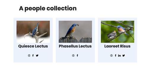
Collection
The Collection element lets you display a grid of persons or a list of organisations:

A 'people' collection displays a grid of person cards:
An 'organizations' collection shows a list of organization profiles:
